
Candle Craft 21: Outfit Your User Interface
By Royal McGraw
Royal McGraw has written professionally for film, television, comics, and games for over 20 years. He led development on the mobile smash hit Choices: Stories You Play and currently serves as CEO of Candlelight Games.

Welcome! This is the 21st installment of a multi-part series on how to improve your writing process and storytelling.
In the previous installment of Candle Craft, we talked about Teacups Theory. This is the theory that players are okay with guardrails around what their choices can do. What they want more than anything else is clarity around what they control. I wrote:
Every interactive narrative makes a promise about what the player controls. The player does not need to control everything. In fact, most players do not expect to control everything. They understand genre. They understand structure. They understand that stories need shape. But they do want to know what they control.
In that post, I was referring to the entire narrative framework. But as we have stated many times, all writing tools are fractal constructs. They apply to the big picture and the small.
Today, we are going to talk about one of the most common (and certainly most underdiscussed) mistakes that I see in interactive narrative.
Cover Models
We often hear the phrase “Don’t Judge A Book By A Cover.” Authors rarely have the luxury of judging their own work so succinctly. Manuscripts have no cover!
Likewise, we narrative designers play lots of games, but we often do our work in rather spartan quarters. Maybe we work in Articy Draft or ArcWeave or (my personal favorite) Ink.
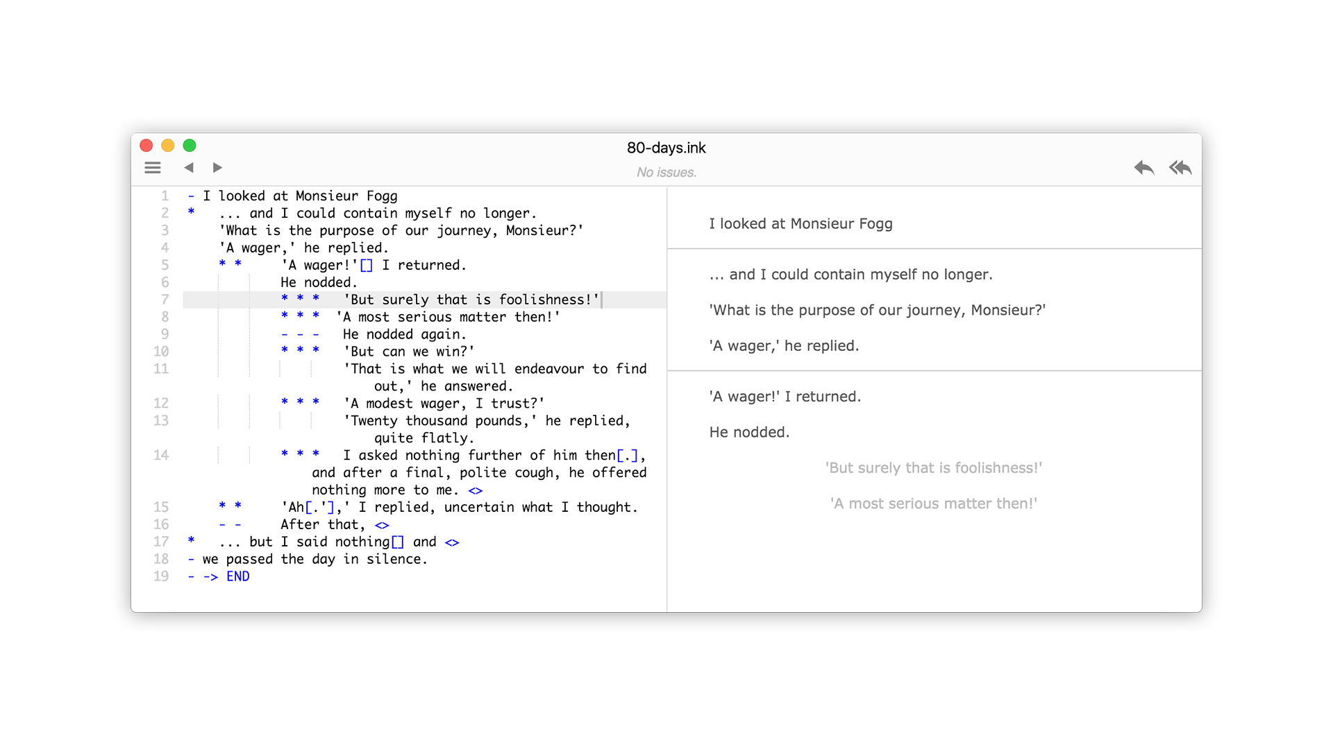
This fact is important, because how we work impacts how we think about our work.
Here we have a few different choices written in .ink syntax.
*This is a choice.
**This is a choice.
+This is a choice.
++This is a choice.
*This is a choice. ~ score = score + 1
These all look nearly identical while indicating significantly different behaviors. It’s no wonder then that we narrative designers refer to them the same way: as just choices.
But they aren’t all “just choices”. Mechanically, they do very different things. You use these options in very different ways. And just like readers can see the cover of a book before they decide to make their purchase, players see the UI/UX of options presented to them in-game. This matters!
Clothes Make the Man
Let’s take a look at some modern games to see how they present choices. Here are two screens from Telltale’s The Walking Dead.
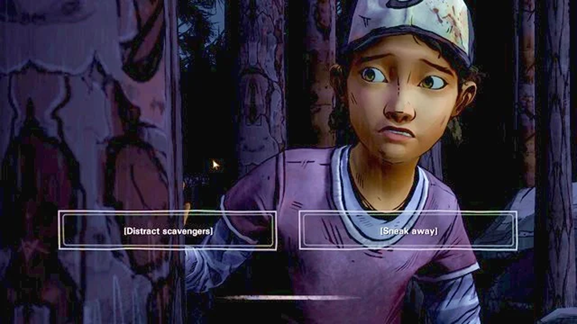
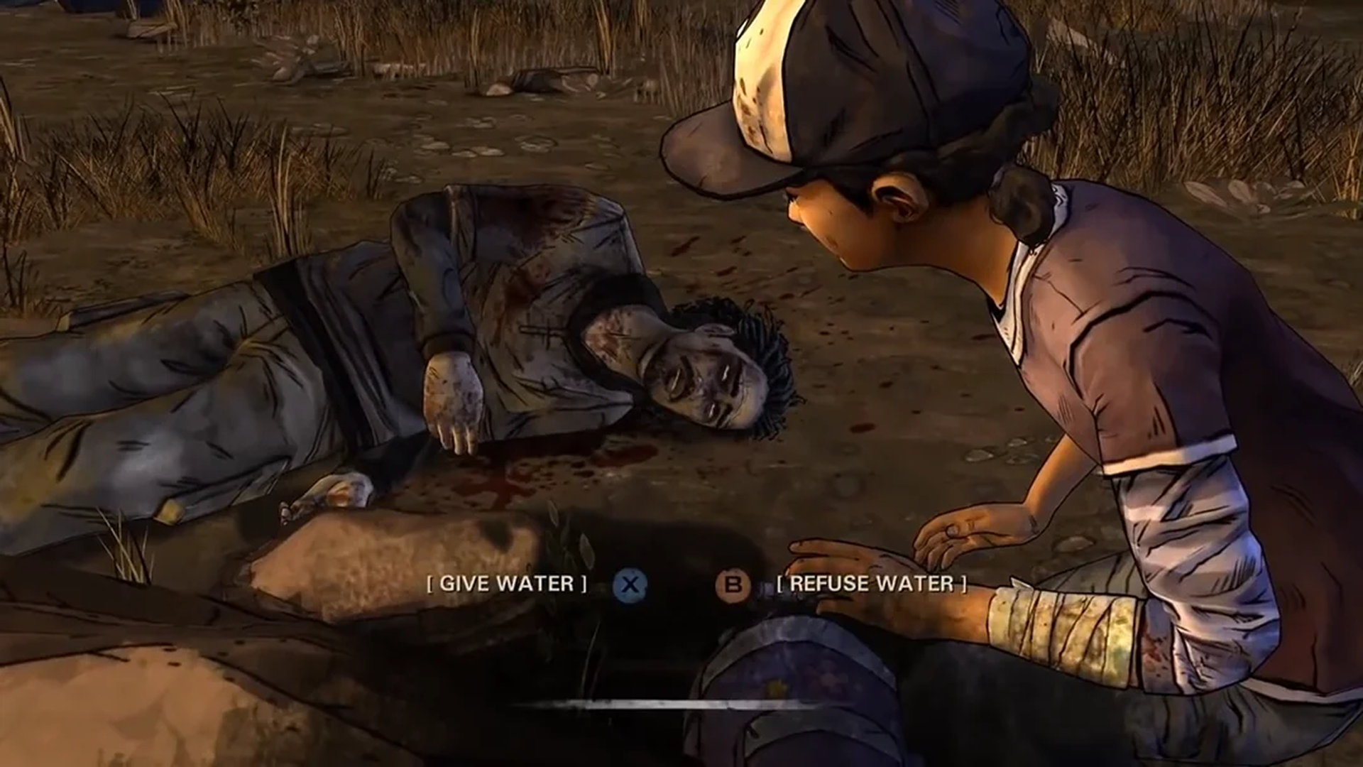
Which of these choices really matter to the story? Can you tell? Both of these decisions are life-and-death, but only one has any impact on the future narrative at all.*
Next, which of these choices from Until Dawn really matter to the story? Can you tell?
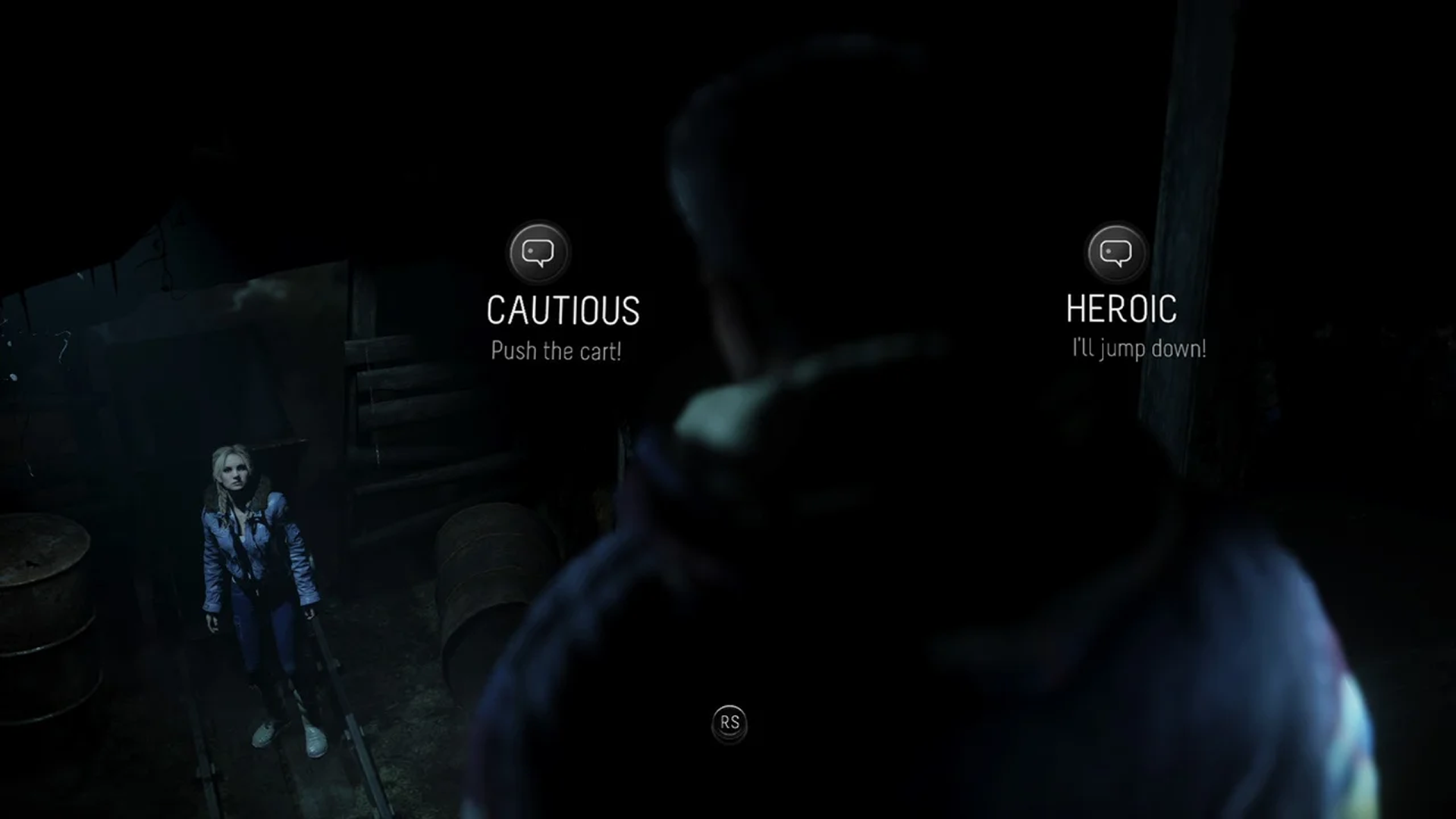
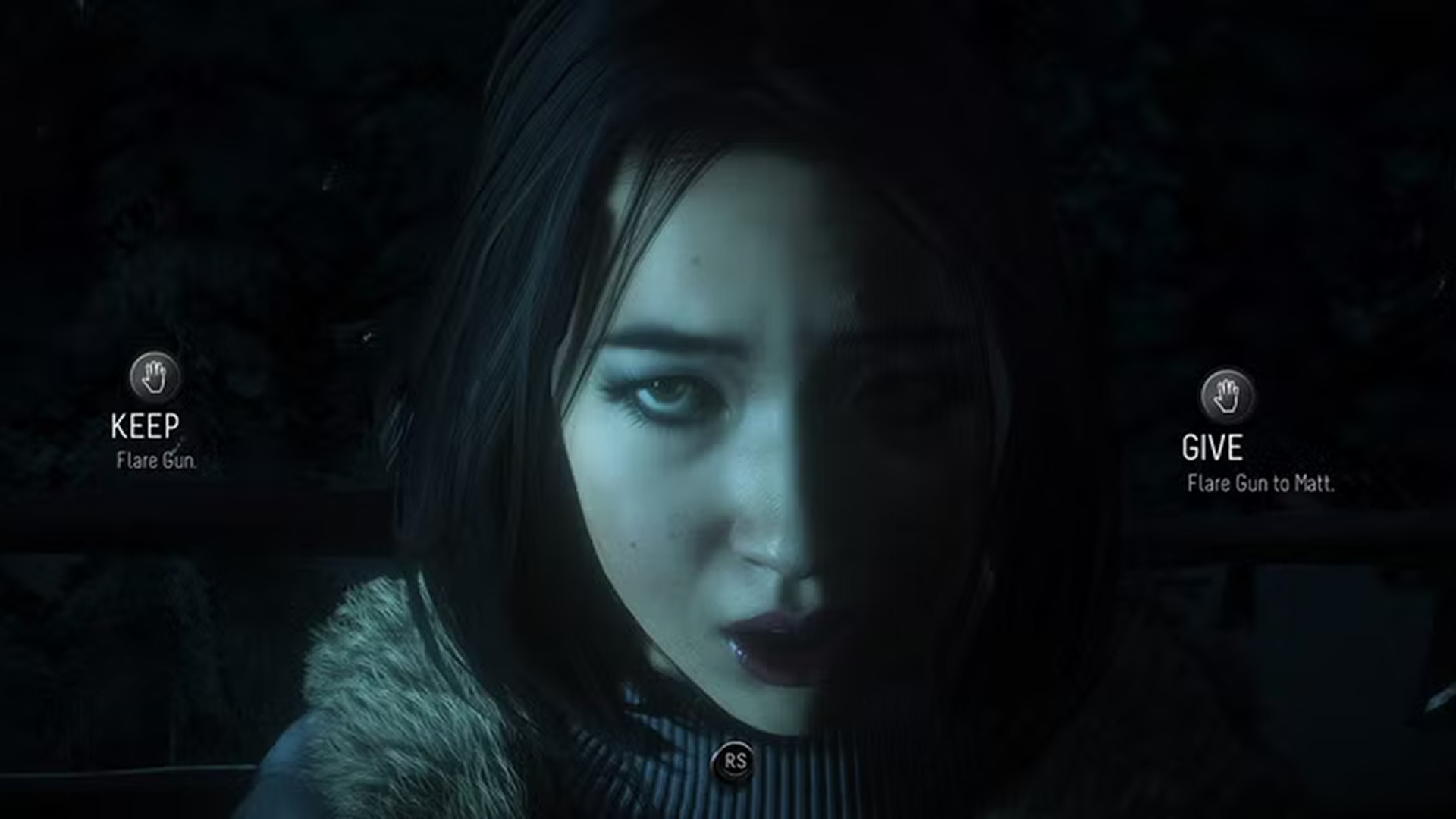
Until Dawn is especially interesting, because the designers knew that they were creating choice cascades that would have long-lasting consequences.
We came up with the idea of the Butterfly Effect to let the player know that they had done something significantly consequential, and to allow them to follow the subsequent knock-ons that would lead to an outcome.
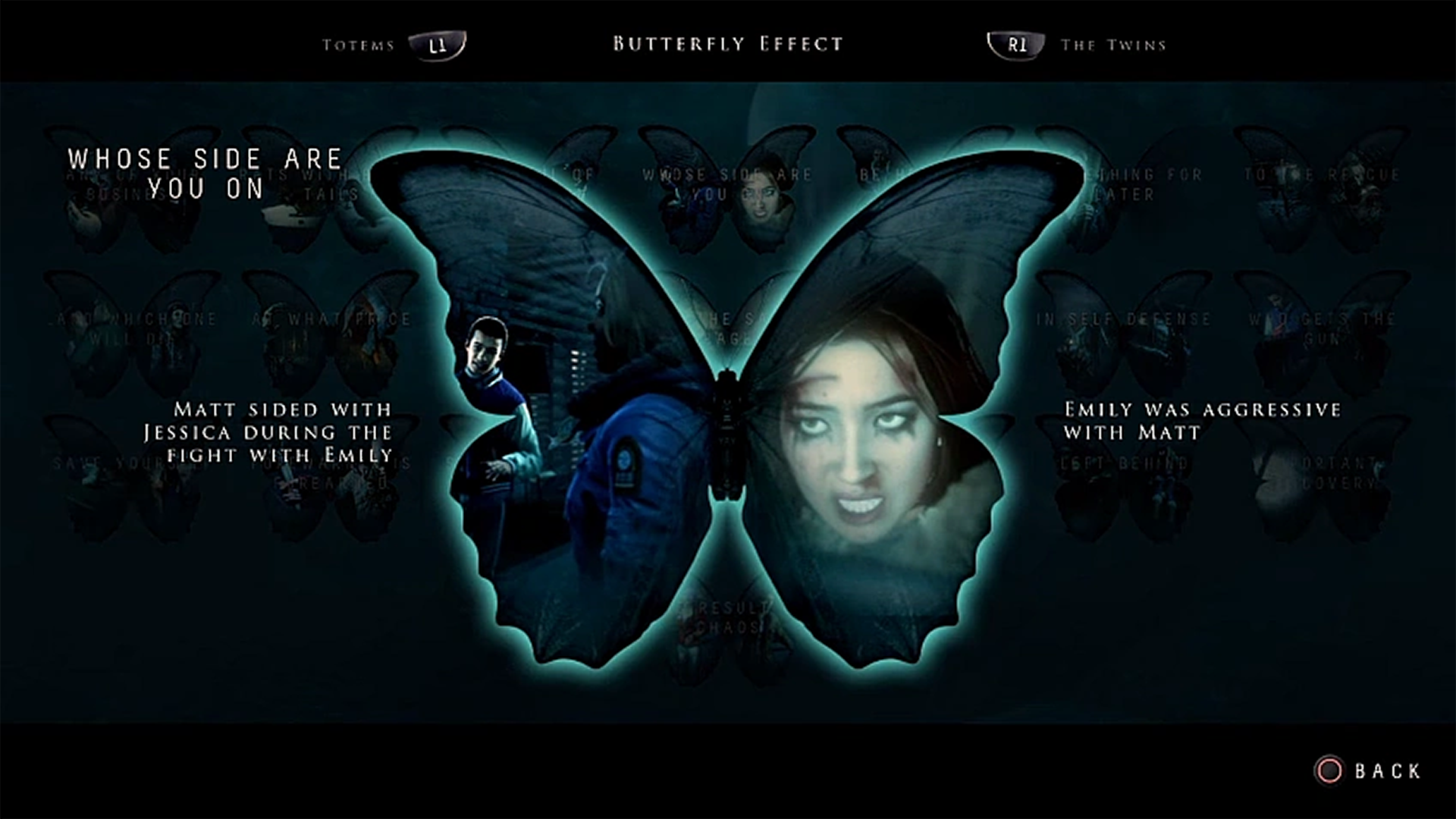
This is a wonderful idea, but it solves the problem retrospectively. Players don’t know which choices matter until after they have already made their decision.
Even forewarned, players can't change their behavior selectively. Every new choice must simply be taken as it comes.
But it doesn’t have to be this way. In Life Is Strange, players make choices frequently. Most have some small amount of impact on the story. Those choices look like this.
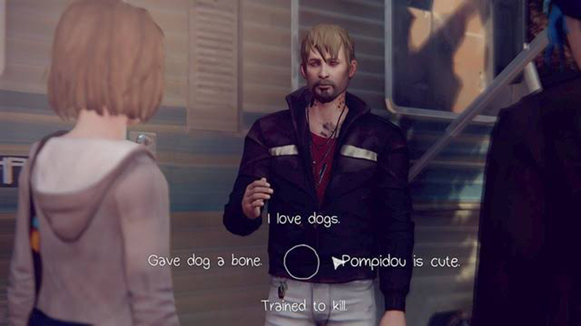
There are many options here, some clearly indicating the attitude affected in the response. These choices seem small, and they are small.
Big impactful choices are strictly structured as screen takeovers. They are always presented as binary options. Time stops.
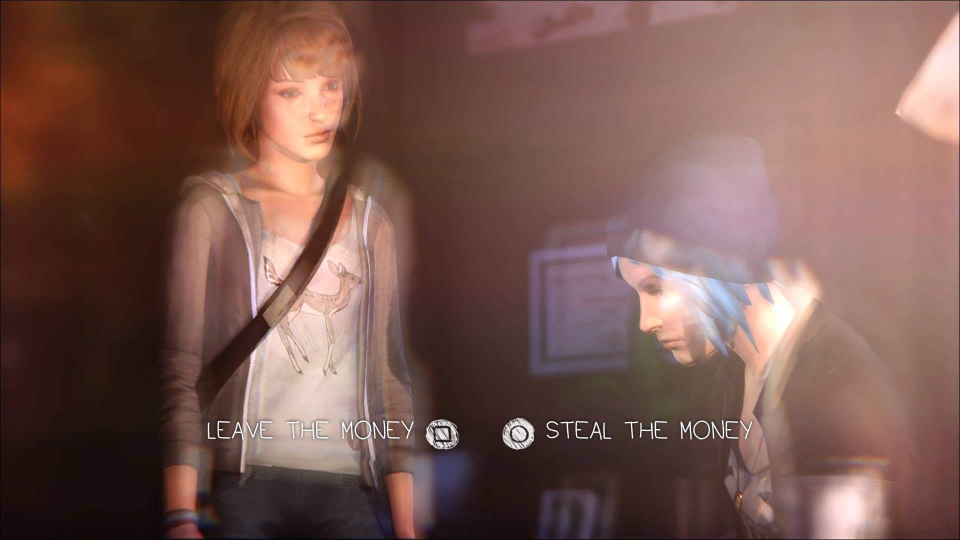
The screen loudly communicates “Whoa, slow down! Take a moment to think!” The interface isn't merely telling us how important the choice is. It is telling the player how to think about the choice.
A lightweight dialogue choice asks for instinct. A stat choice asks for calculation. A screen takeover asks for deliberation. Different choices require different mental behavior from the player.
Dress for Success
So taking our cue from this example, we should strive to understand what job each kind of choice is doing for us and we should dress them up accordingly.
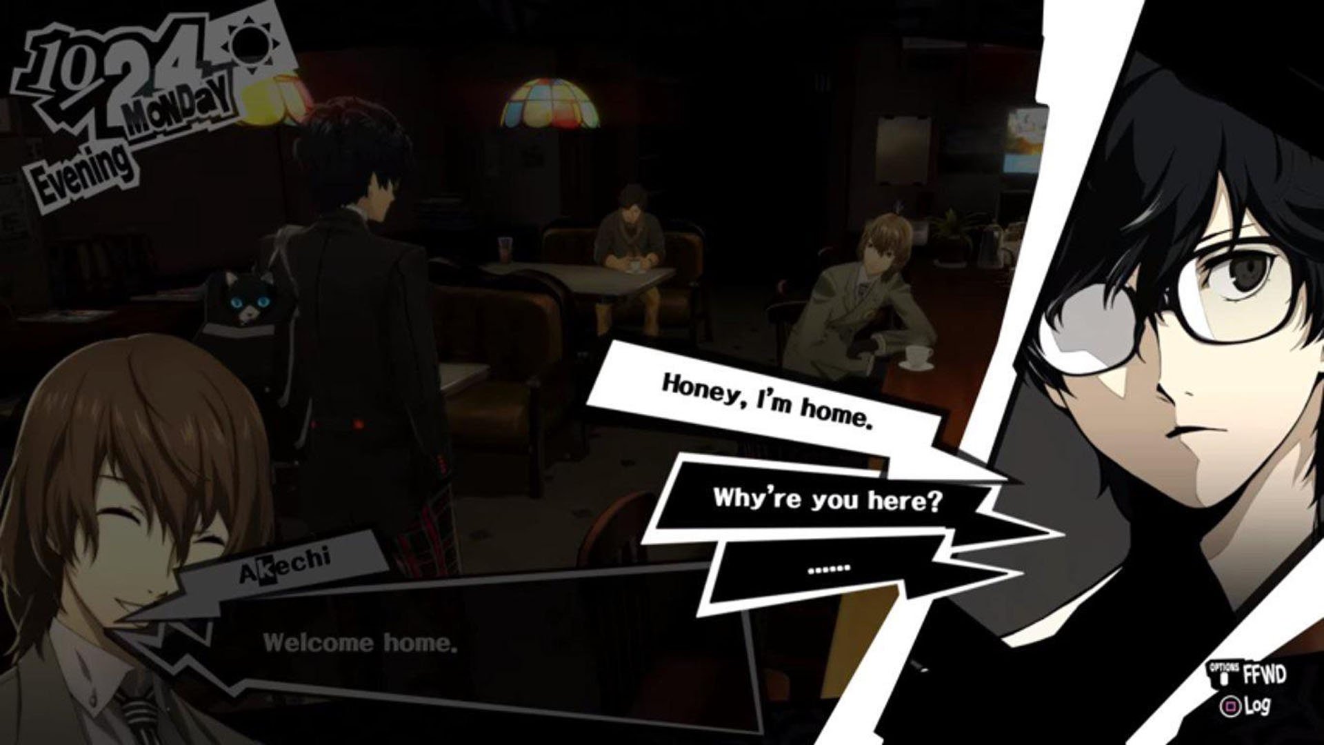
Choices that provide flavor are fleeting. Make sure they stay fast and light. Persona 5 is a great example. Even highly stylized choices remain quick and conversational.
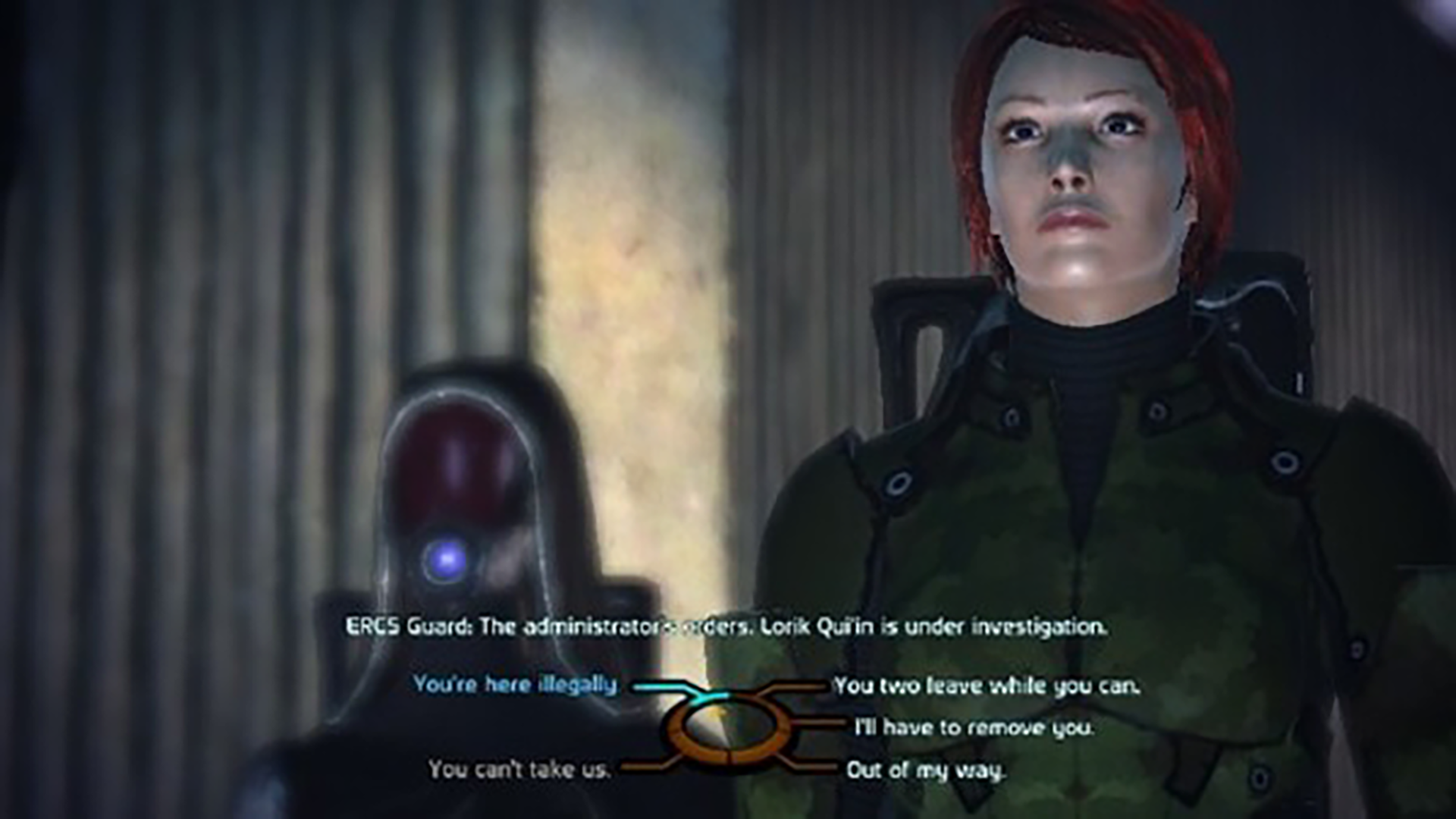
Choices that increment stats mean business. Dress them for work.
Mass Effect wraps dialogue in a system that tracks alignment and relationship status.
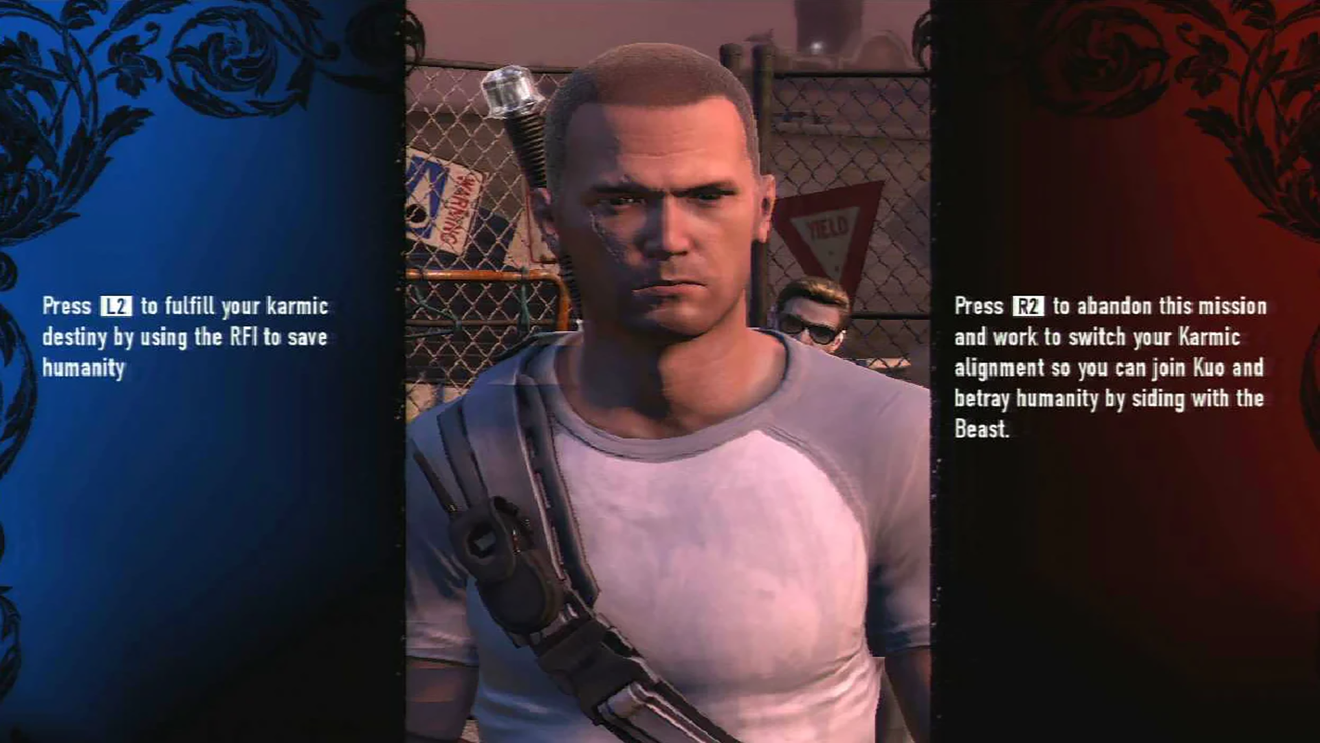
Choices that change the direction of the game are big and powerful. The user interface should showcase their significance. InFamous makes the distinction impossible to miss.
Our job as game designers is to offer maximum clarity around what kind of choice is being made.
Our job as writers is to make sure those choices deliver surprise and delight.
Last Year’s Fashion
Over the years, I’ve heard many rebuttals to the argument that I’m making here. They all boil down to the same basic idea. Designers tell me “I want the player to discover the narrative.”
I cannot stress this enough: this is a bad argument.
First and foremost, this is a designer-centric argument masquerading as a player-centric one. This argument can only come from a place of knowledge beyond what the player has at the moment.
The player doesn’t know what there is to discover, so why would they care? Why would the player bother to explore? What reason are you giving them right now, at this very moment?
If you’re not answering that question, you’re not actually answering any question at all. Sure, writers can “hope” that players will uncover their carefully constructed narrative through multiple playthroughs, but that’s not the job. The writer’s job is to make a player feel something in the moment.
Second and most importantly, providing clarity does not diminish what comes after the choice has been made. In fact, the reverse is true. The player who understands what kind of choice they are making can feel strongly validated when the game delivers on that promise.
Clarity about the kind of choice is not clarity about the outcome of the choice. Eliminate mechanical ambiguity. Preserve outcome uncertainty.
Fit Like a Glove
Going forward, think deeply about your narrative systems. Classify the different kinds of choices in your games. What do the choices do for the narrative? Mechanically, how do the choices differ in function? How can you communicate those differing mechanical functions through user interface design?
Always remember:
Tell players what they control.
Tell them what kind of decision they're making.
Don't tell them what will happen.
Lesson: Your choices should always wear an outfit that communicates their function.
*To be completely fair, Telltale’s The Walking Dead offers a second kind of physical, rather than verbal, choice. These choices also appear almost entirely, but not universally, during big moments. This ratio is the inverse of dialogue choices. Because of the distribution, I think we can safely conclude that these choices are intended to communicate physicality rather than narrative importance.